Thanks Russell for your speedy feedback! It is really encouraging to read and I’m happy with the suggestions Russell has made. Below you will find the report
It is really encouraging to read and I’m happy with the suggestions Russell has made. Below you will find the report in bold and my response in italics:
This first Documentary assignment has been received very positively; you have produced a good set of images, which portray a considered technical approach. A few of the images may benefit from cropping. Your project is supported by a good and well-presented learning log, which documents your progression and visual research quite suitably for this level of study. Your aims and objectives have been met and you have produced a well-structured reflection.
Happy with this overall feedback. I will start thinking about other ways to present the photographs and experiment with different dimensions and captions.
Feedback:
Demonstration of Technical and Visual Skills
You have submitted a set of images that are technically good; they evidence a competent design and visual awareness, coupled with an overall successful compositional approach. A couple of your images may benefit from postproduction cropping; however I would recommend to experiment with other aspect ratios. For example, with DSLR’s, the default aspect ratio that is outputted, is 3:2, which is based upon traditional 135 film size of 24mm x 36mm. As an experiment, I would suggest trying a 1:1 square ratio; I’ll admit that I have a tendency to suggest this ratio quite often, as it is based upon older camera formats by photographers* I admire. Anyway, through performing such postproduction cropping and documenting it, you will be providing further evidence for the ‘experimentation’ aspect of the ‘Demonstration of Creativity’ assessment criterion. As an example in investigating possible composition values, I have taken two of your images and cropped them square. Please see the next page…
Even though this crop removes much of the surrounding scene, it does focus the viewers gaze more to the man that the caption refers to. I do realise that this has removed the ‘Technical Department’ sign to the right of the frame, which does provide a great clue to the people and their role within the environment.
I agree that I should experiment a bit with different crops and ways of presenting. I’ll think about it and try different things while I am reading the second part. I did leave the sign technical department for the clue, on the other hand, with the caption there is already enough information to know what the image is about.
Out of your entire set, one of the weaker images in terms of composition, is the one titled, ‘Guard’; the subject is quite distance and is not as visually connective as the other situational portraits you have produced. Also, with the image titled, ‘Adri en Yvo’, the chair in the foreground is a little distracting. The image titled, ‘Sanneke’ is very good, the lighting is ideal and the slight drama and thrill of the sitter being photographed pulls the viewer into the scene. Well done.
There is another ‘Guard’ image, which is a direct portrait. I chose to add this one because I think it portrays the distance that I feel with him and the dreariness of his job. I’ll think of changing it so that the entire set is mainly portraits. I’ll also look at other images of Adri and Yvo and see if I can find a stronger one. The reason I chose this one is that I liked the interaction and expressions on their faces.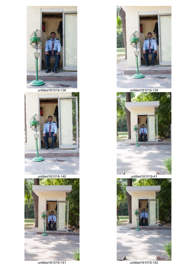
Quality of Outcome
In your learning log, you have evidenced a very competent realisation of ideas,
which have been well presented throughout. You have applied your knowledge
and produced a project that communicates your thoughts and direction to a
good level. The presentation of the work has been very successful; the captions
that are placed with the images, within the page layouts, demonstrate a
considered and coherent approach.
Regarding the captions/text, a couple of them could do with revisiting; there are
some mixed connotations, which start to blur the divide between the local staff
and yourself. For example, with the image titled, ‘Patrick & Pushpa’, the end line,
‘Patrick has lung cancer’, comes across quite bluntly and hard. You have stated
that you wish to communicate the divide; yet the other line for this image,
‘Pushpa can bake Dutch apple pie like my mother’ starts to make a personal
connection, thus blurring that divide.
Maybe I have not been clear enough in the brief that the relationship that I have with all the staff differs a lot. Pushpa and Patrick know a lot about our lives since they are in our home every day. I want to show that there is a difference between all the people I meet on a daily basis. It is not so black and white. I wanted the lung cancer caption to sound blunt and hard, just to show that there is much more behind what we see, especially when it comes to people who live and look very different than we do. It is something I struggle with daily because the healthcare system is quite bad in India and I worry about him and his family.
Demonstration of Creativity
You have evidenced a creative approach to this assignment; but there is little
evidence of risk taking in your learning log, where the technical experimentation
and development is limited. However, your personal voice is evident through this strong social documentary, which has some interesting avenues to explore.
I understand your point, in which ways can I show more of the creative process? Maybe add more of the post processing, or other ideas that I had?
Your aim of illustrating the divide between the staff and yourself was a very good starting point. Visually this has not been overly clear; however, the inclusion of friends and family coupled with the impersonal and personal captions has resulted in a very good series.
As mentioned above, the word divide might not be the right term. But there is a divide and I want to show in which ways I try to bridge it, by acknowledging their struggles or jobs, while at the same time demonstrate how far I am removed from it, even though I see them every day and they really take care of us.
As part of your technical creativity and visual development, further experimentation into compositions and design would be good. For example, what may have worked in emphasising the divide, would have been to approach the staff portraits at one focal distance and another for your friends/family, this would have added visual distance and separation within the frames. For example, ‘Kishan Store’ and ‘Bart’, both share a very similar composition and design, yet ‘Gardner’ is quite distant and focuses more on his duties and the environment.
The reader mentioned we had to use the same focal point for every image, so this has not come to mind. Even though Kishan Store and Bart are very similar, the expression on their faces tell a completely different story, which what I had focused on. Anyway, I have not thought about showing the differences in a compositional way, this might be something to explore in the next assignment.
It was good to see your experimentation into layout through the page designs; the typeface is a good choice and the cream/off-white background compliments the warmth of the light temperature. Again, to strengthen the experimentation and developmental aspect of this working methodology, it would have been good to see some alternative layout designs. Even if they were unsuccessful, the documentation and commentary of these would clearly evidence to the assessors ‘risk taking’, ‘experimenting’ and ‘development’. Please see on the next page an experiment in layout: With this image, I took the square crop of the ‘Technical Staff’ and placed it next to ‘Julian Guus’ to make a diptych. This pairing is interesting, as it appears that the taller gentleman in the left frame is observing the figure in the right frame.
I will come with some other design options, thinking about it has already triggered a few more ideas.
Context
There is evidence of a considered research approach to this project; your interpretation of the material is good in which you have made some suitable comments. Regarding the ‘lack of vocabulary’, this will indeed take time and practice; throughout this course your understanding and application of visual language will develop and start to become second nature.
Let’s hope so! I am reading more, so I trust it will grow on me more.
Although there is not a strong contextual presence within your assignment, there is evidence of a good critical awareness within your learning log/blog. For example, the post ‘Discontinuities – Captions’ is very good, ‘…keeping a distant surveying view…’ would be good to explore further.
With your images, how does the text govern the reading, would handwriting the captions produce a more connective visual response; what about getting each subject to write their own caption?
I have thought about that, but since the brief was to show my own connection with the local community, I thought it would be more appropriate to write down my own thoughts. Maybe I can do both, that might give a stronger narrative.
Learning Logs or Blogs:
Your learning log/blog is good; there is clear evidence of the unit’s exercises and research points being explored. The post, ‘Documentary as a paradox’ was very good to read, your images that accompanied this post are strong; movement in an image always adds drama and depth.
Thanks! I enjoy reading the articles and develop a deeper way of thinking about images. I’ll try to add more images to the learning blog as well.
The book that you are creating along with the other 21 foreigners in New Delhi is wonderful; the thought, conception and overall objective of it, was very good to read about. Your image, ‘Home for retired cows’ is beautiful, the composition is strong and the pigeon just adds something to the frame. Perhaps it is the colour of the wall, but It reminds me a little of Yann Arthus-Bertrand’s work, see: http://www.yannarthusbertrand2.org/index.php?option=com_datsogallery&Itemi d=27&func=detail&catid=5&id=89&l=2560
It looks like we’ve already sold all the books, so it’s going well!
Suggested reading/viewing:
Earlier in this report I mentioned photographers* that I admire who predominantly shot with square 1:1 format cameras. You may have already seen her work through online forums and documentaries, but if not, then please check out the wonderful collection of Vivian Maier: http://www.vivianmaier.com/ A little bit grittier, where perhaps some of the compositions are not as structured, but there is a beautiful rawness to the following photographers work: http://www.albertogarciaalix.com/en/works/
Pointers for the next assignment:
Assignment Two is a challenging one; it is about producing images that have strong independent narratives within them. You could use Assignment One as a springboard to develop and push some of your ideas further, but the brief does ask you to explore an abstract approach. I would avoid ‘Staged Photography’, but it may be good to explore some of the compositional qualities indicative of this genre to set some of the scenes, which may help to produce the narratives.
On a final note, I liked the image of ‘Bart’ it reminded me of a shot from Alec Soth’s series ‘Sleeping by the Mississippi’, you’ll see the one I’m thinking about. Anyway explore this series and look how the photographer has mixed portraits and landscapes together to form this interesting and revealing document about this environment, see: http://alecsoth.com/photography/?page_id=14
I’ll have a look at these photographers and write a few blogs about them, it seems very interesting. Regarding the 2nd assignment, I have just started thinking about it and some thoughts are already springing up that I’ll start writing about. I see that I have to add much more of the thinking process and show my ideas in images. I want to get better at this!
Assignment assessed by Russell Squires Assignment assessed on 29/10/2016 Next assignment approximately due 29/12/2016
